Monday 29 September 2014

Health and Safety Checklist (for shoot day)

For this project I have included the new university format health and safety sheet, aswell as my own sheet which I have used throughout my studies;

Below is the patch test sheet supplied from the university and also the health and safety procedures sheet. I found these very universal for artists of both prosthetic and fashion/beauty make up application. I have included my sheet below which I referred to more, as it is more specialised in the editorial beauty format I am working with for this unit. I have also only included the patch tests that I conducted for products which were to be used within my project. Please see a copy of all sheets below;


Final Budget

The costings brought forwards before this update are listed below;

Wig lace - £15
3 x synthetic Hair - £9.86
Artificial Flowers x60 - £45.99
Tutu Net and Ribbon for Cages - £11.52
2 x Stitching thread - £2.00
Korean Knotting Hook - £1.84
Weft Thread - £10.00
Hot glue gun - £5.00
Hot glue sticks - £1.00
                                        
Subtotal              £102.21

As mentioned my photographer has given £350 towards clothing for the shoot - to be returned from refund.


Added to this are items below;

Petrol - 150 miles at £0.116 - £17.40
Food for the day - £5.89
                                               
Overall Total Spend  £125.50

I am very happy with the final spend, which is not too short of what I had budgeted myself, so without consciously scrimping to stay in budget I have managed to save a little bit of money, but kept very close to the budget I had set of £150, meaning my estimating before hand was very accurate.


Sunday 28 September 2014

Submission to Faceon Magazine

Myself and my photographer believe it would be beneficial to submit our work to a printed magazine. As outlined in a previous post, FaceOn Magazine is one which from a make-up perspective I believe would be the correct commercial context for our work to be viewed in. Despite the fact we may not have our work published, I feel as a third year student that submitting my work for publication is a step I should now be taking to meet the context designated in my brief and also to help establish myself in the industry and also my professional identity. 
Please see the image of the email below;

Saturday 27 September 2014

Mock Magazine Layout Inspiration

Before I design my mock magazine I wanted to refer back to the  context I am trying to recreate. I have inserted a few of the FaceOn Covers and articles that may help to inspire my cover.

The cover on the left uses a selection of colours in the font surrounding the image, which have been selected from the image and help tie it together. The composition of the magazine is layed out very clearly with alot of different fonts and sizes of font used to keep an interesting yet subtle flow of text around the image.
I like how the magazine title is clean and white, and very clearly tells the audience what they are reading.
The cover on the left I did not like as much. The make-up is very blended into the background, and dosent get the attention it should. Also the title is hidden behind the image, which i find looks quite messy, and the black title at the bottom of the page is very bold, not blending in with the rest of the image  composition.


The composition of photographs on the left work very well together. The black and white border makes the pink colour of the feature stand out especially as the backdrop used was grey, so the page doesn't look too white!
They started the feature off with a small graphic under a large image containing the words 'face off presents' which gives a nice introduction before flowing into the title of the piece and the bulk of the writing. I also like the coloured credit section on the right hand side. Using a pink text to highlight the title of the credits before using an easier to read black font to list the credits.

The right hand image is a feature regarding looks and products used to create these looks. I like the borderless images, with a small section of font, and was also drawn to the floral headpieces used in the images. If i was creating a whole mock magazine this would be a good idea to consider including in my work.


I also looked at 'onmakeup magazine' which contained a centrepiece of memorable high fashion/editorial magazine covers from a selection of years. This was good to compare with the style of fashion editorials and my own work. I feel my work definatley has a place as a make-up magazine feature rather than as a fashion editorial as a lot of these are studio based and my location is not one that would feature on a fashion magazine cover.

Initial final image selection and unplanned reshoot


After a day of shooting, myself and Rachael sat down and selected what we thought were the best images. We found this quite easy and obviously as this was Rachael's part of the project I was more than happy to compromise and value her expertise and opinion on this. The above images have all been edited to contain a similar element of lighting, as we found that the image at the top centre right, which was shot at sunset contained the best light, whereas the rest had very bright lights from the suns high location. The lighting gives off the effect of the spring summer feel the shoot needed to have and I am over the moon with the images and how they work together with the styling and hair/make-up. 
However the image above only shows 7 of the 8 images Rachael required - this is because we did not find the close up editorial beauty shot we had wanted on the day. This was a problem, and although we had tried our best to compromise with the remaining images, we came to the decision that we had to shoot an editorial close up on a separate occasion. This is something we hadn't planned would happen, however we worked together with our model also to find a time that we could all pull together and get the required shot. We have chosen to do this on Friday 5th December at 6:45am, so that when the sun rises at 8am we can get the shot on some local greenery located in winton, and that will fulfil the brief. 
 On the friday morning, we started early and I applied the second cage wig which was simple but also the wig we got the least shots of on the day. The make-up was the brown gold natural smokey eye, which worked beautifully with the colour of the lips (fuchsia gloss pink) and the models skin tone. We used a bush located at the end of Rachaels garden on the day, as it was such a close shot the background actually had become an irrelevant issue. And the final shot we got was absolutely brilliant. I am pleased we did shoot this again as I had time on my hands on the day to create a precise, perfect make-up which would showcase my ability and work incredibly well as a beauty shot to submit for my project.


Friday 26 September 2014

Final Collective Images

 PLEASE NOTE: THESE ARE THE 8 IMAGES MY PHOTOGRAPHER SUBMITTED AS A LARGER COLLECTION. I WILL BE CHOOSING A MAXIMUM OF 4 OF THESE IMAGES AS OUTLINED IN MY PROPOSAL, PLEASE SEE MY LATER POST!
The above images use the long blonde wig, created as my models hair was originally pink when allocated for my project. The makeup uses a pink gloss lip, combines with a feminine purple eye, and represents Titania, queen of the faeries emerging from her kingdom into the stately home of the human monarchy. The images are very playful and explorative and the styling and positioning of the model fits the high fashion brief outlines in my proposal. 


The above images now demonstrate the change in Titanias attitude, using a green eye to represent envy, clashing with a purple lip, which I believe expresses the uncertainty in who she wants to be at this point, and if she is questioning her existence as a faerie rather than a human queen. The extravagant tall wig, is something that trys to get her noticed by the human people, as she does not understand she is invisible as she has such a presence in her own society. The second image and fact her shoes are lost, slowly represent her return to nature, and the fact she has now distanced herself from the house as if she is returning to her own kingdom.


The next set of images represent Titanias return to her own civilisation. The full flower wig represents nature reclaiming her, and the nude smoked eye, and pink lip pull away from the bright colours used when she was searching for attention. The styling I feel is a lot more plain but more regal and lets the natural surround speak for itself within this set of images.


 The last image Rachael submitted is one that was designed directly for her own narrative rather than mine, and is one I will not be submitting as one that fulfils my own brief as it does not fit with the narrative storyline I created for this project. I have however included my design process for this look throughout so that the assessor understands this was also a thought about image that we worked together on to complete my photographers narrative. The high fashion composition of the piece, with the use of texture in the clothing and smoke in the air, meant that the make-up has to be simplistic and this was also true of the way the hair was designed.

Overall I am very happy with the images, which I believe tell the story of Titania through creative arts in a concise, yet outside the box manner. We have chosen to name the collection of images 'Fantasia' the definition of which is (provided by the oxford dictionary); "a thing composed of a mixture of different forms or styles." This is relevant to the change from shakespearian classical storyline, into a high fashion storybook narrative, with alternate hairstyling, fashion styling and an array of colour combinations that contribute to our final images.


PLEASE FIND MY FINAL SUBMITTED IMAGES IN A SEPARATE POST AND ALSO ON MY SUBMITTED MEMORY STICK.

Final Image 4

IMAGE 4 - UNEDITED COPY
 IMAGE 4 - EDITED FINAL SUBMISSION
This image was shot in a small fernery on the estate, which created the beautiful dusky natural lighting on the day, which we have applied to our other images. As per the other images there really is a minimal amount of editing, and the exposure and crop are the only edits made here. There are no cosmetic changes here, with only the lighting making slight facial changes from the raw to edited file.
I chose this image as an almost final image to the collection, of Titania returning to her habitat of a small hidden Faerie like kingdom. The light streaming in makes it look secluded from the open world, and really mystical which was perfect for my narrative. 
If I could change anything in the image, it would be a small addition to the contour of the face, but overall I am very pleased with this image, and believe it gives the ideal 'end image' to my fairytale narrative.

Final image 3

IMAGE 3 RAW UNEDITED COPY

IMAGE 3 EDITED COPY SUBMISSION
The third image in my submission again has undergone a minimal amount of editing and again my photographer mainly concentrated on changing the lighting and crop to a more framed one with a lighting that has been reflected through the series as a dusky misty light. As per the rest of the images some minimal cosmetic changes were made, and in this image there are a few spots, that were covered on the left hand side of the models face and also around the nose.
I chose this image as it is the beauty shot for our collection, and also showcases the floral cage, and make up application extremely well. The fuchsia iridescent lip colour works exceedingly well with the floral colours, and brings the image together on a whole. The only thing I would change about this image, is the length of the eyebrow, on the left hand side, which looks slightly shorter than the images shot on the earlier Saturday, which is a continuity issue I wish to develop in the future.

Final Image 1

After reviewing the images very critically I have chosen the 4 I wish to submit as my final images. These will be listed on the blog in 4 separate posts - each post containing the raw image and the edited one, along with my review of each one and why I chose it. - please click on the images for full scale. 

Image 1 - RAW UNEDITED COPY
IMAGE 1 - EDITED FINAL COPY
This image has had a minimal amount of editing, and my photographer mainly concentrated on changing the lighting and crop to a more framed one with a lighting that has been reflected through the series as a dusky misty light. Some small cosmetic changes were made, for instance the models knee was bleeding and this was edited, and also exposure that was beaming from the light blonde hair was made a lot more subtle.
I chose this image as the composition of the model close to the building, tells the narrative of my shoot and Titania stumbling upon the human monarchy and also makes her look very small in proportion to the architecture around her which is ideal for the faerie theme. The length of the wig is a lot more visible here compared to the other images, and the styling along with the colours of the make-up - particularly on the lips really compliment each other and showcase the work as a collaboration.
If I could change anything in the image, I would look at making the foundation base a shade lighter. We did a complete make-up change prior to this look, to freshen the face and keep continuity, as the base was beginning to look tired, despite the use of primer beforehand. I also would consider an extra application of eyeshadow, however I was very disappointed with the mac eyeshadow 'parfait amour' on the day, which was very under pigmented, and took up a lot more time due to application taking a lot longer. I would even consider another product for this, but overall I am very happy with the image, and the wig which looks well styled and also well tamed, considering it was synthetic hair.

Final image 2

Final Image 2 - RAW UNEDITED COPY
FINAL IMAGE 2 - EDITED FINAL SUBMISSION
This image has also undergone a minimal amount of editing, and my photographer mainly concentrated again on changing the lighting to the dusky light we want to reflect through each image. Again the image crop was reduced to focus on the model, and also the architecture of the house. The cosmetic changed that were produced here were that more texture was added to the models natural hair that blended into the synthetic hair. Although I have crimped her hair prior to application, it did not hold as well as I had liked and therefore my photographer and I decided to apply a more visible texture across the whole wig. The wig has a lot more light exposure bouncing from it in the new edited lighting, which has made the wig look slightly yellowed, however when viewed in full frame this is not as visible as when panned in onto the face.
I chose this image to carry on from the first image as the composition of the model close to the building carry on the setting initially set. The narrative carries on with Titania now seeking attention from the human monarchy (still not understanding her unseen faerie state). She is wearing a green eyeshadow, representing the envy she has to be part of this society, and also a fuchsia pink lip, causing a intentional clash of colours, pulling the audience to her face. The wig is propositioned along with the models back against the wall of the building, and this portrays Titania being neglected from the home and left outside. The wig is shot from the side with the flowers adhered, which keeps the natural detail and basis of narrative in the storyline in a subtle way.
If I could change anything in this image, I also would consider an extra application of eyeshadow, however I was happy with the liberal application of the green shadow, and I think the editing has just slightly filtered the effectiveness of the green from the image. I am very happy with the wig, however was slightly reluctant to use this image as I feared the wig looked as if it was being 'leaned' against the building to stay upright - which I assure you is not the case. Please see the complete 8 images on a previous post, to see another image of this wig freestanding.
Overall I am very happy with the application, in particular the wig, which took me a lot of time to figure out how to apply it, but once applied the hair colour was blended really well, and also the make-up application was particularly effective with the costume, especially the lips combined with the patterned floral shoe. 

Thursday 25 September 2014

Mock Magazine Feature

To fulfill my context of creating a high fashion magazine feature I have created a mock up issue of 'Face On Magazine'. It is comprised of a cover photo and 8 pages displayed as 4 double page spreads. I was surprised by how convincing the images are, and am very pleased with the final outcome. Again I must say this is not a genuine magazine!


Bibliography

Bibliography
BBC History (2014) William Shakespeare [online] Available from: http://www.bbc.co.uk/history/people/william_shakespeare/ (Accessed October 12th 2014)
Blogspot (2010) Titania Illustration [online image] Available from: http://amanda-farrish.blogspot.co.uk/2010_03_01_archive.html (Accessed 17th October 2014)
Bird.E (2002) Faerieality [book] London:Walker Books
Cox.C/ Widdows.L (2005) Hair and Fashion.[book] London: V&A
Corson.R (2001) Fashions in Hair: The first five thousand years. [book] London:Peter Owen
Cottingley Faeries (1909) Cottingley Faeires [online] Available from: http://en.wikipedia.org/wiki/Cottingley_Fairies#mediaviewer/File:CottingleyFairies3.jpg (Accessed 17th October 2014)
Froud.B (1998) Good Faeires: Bad Faeries [book] London:Pavilion
Gorgeous Pfieffer (2000) A midsummer nights dream [online image] Available from:http://www.gorgeouspfeiffer.com/film_99_midsummer_review.htm (Accessed October 20th 2014)
Hair History (n.d) The history of hair and wigs [online] Available from: http://thehistoryofthehairsworld.com/hair_18th_century.html (Accessed October 29th 2014)
Kirsty Mitchell Photography (2009) Wonderland Photoshoot [online] Available from: http://www.kirstymitchellphotography.com/gallery.php?album=5 (Accessed October the 20th 2014)
Kościukiewicz-Markowska. D (2013) Palace of Colours. The magic of make-up New York:Movart
Leicester Galleries (n.d.) Hermia and Helena Paintings [online image] Available from: http://www.leicestergalleries.com/19th-20th-century-paintings/d/fairy-school/john-simmons/13779 (Accessed 17th October 2014)
Lowery, A. (2013) Historical wig styling : Ancient Egypt to the 1830s. Abingdon: Focal Press.
Make-Up Artist Magazine [journal]

Musgrove.J (2002) Make-up, Hair and Costume for Film and Television [book] Focal Press.
My Portrait Hub (2014) Smoke Bomb Examples [online] Available from: http://myportraithub.com/smoke-bomb-photography/ (Accessed November 18th 2014)
National Gallery (1905) Ophelia Amongst The Flowers [online] Available from: http://www.nationalgallery.org.uk/paintings/odilon-redon-ophelia-among-the-flowers (Accessed October 9th 2014)

National Gallery (1530-2) Portrait of a woman inspired by Lucretia [online] Available from: http:// www.nationalgallery.org.uk/paintings/lorenzo-lotto-portrait-of-a-woman-inspired-by-lucretia (Accessed October 9th 2014)

National Gallery (1899) Russian Dancers [online] Available from: http:// www.nationalgallery.org.uk/paintings/hilaire-germain-edgar-degas-russian-dancers (Accessed October 9th 2014)

Rankin (2009) Alex Box by Rankin [book] London: Rankin Photography
Ririnui. J (2010) Make-Up is Art [book] London: Carlton Books

Ruskai. J (2010) Wig Making and Styling: a complete guide for theatre and film [book] Oxford: Elsevier/Focal Press

Segal.S (1990) Flowers and Nature [book] Hijink Int: Amstelveen.
Shakespeare. W (1979) A Midsummer Nights Dream.[book] USA: Arden Shakespeare
ShowStudio (2013) Alex Box [online] Available from: http://showstudio.com/contributor/alex_box (Accessed October 31st 2014)
Sparknotes (n.d) A Midsummer Night’s Dream Overview [online] Available from: http://www.sparknotes.com/shakespeare/msnd/summary.html(Accessed October 13th 2014)
Sparknotes (n.d) A Midsummer Night’s Dream Character List [online] Available from: http://www.sparknotes.com/shakespeare/msnd/characters.html (Accessed October 13th 2014)
Timeless Myths (2004) The origin of faeries [online] Available from: http://www.timelessmyths.com/celtic/faeries.html (Accessed October 18th 2014)
Viona Art (2010) Woodland fairy [online image] Available from: http://www.viona-art.com/portfolio/archive/fairy (Accesed October 13th 2014)
We Heart It (n.d.) faerie image [online image] Available from: http://weheartit.com/entry/group/2485183 (Accessed October 13th 2014)
Widdows.L McGuiness.J (1997) Image Makers – Professional Styling, Hair and Make-Up [book] B.t:Batsford
Wikipedia (2013) Smoke Bombs [online] Available from: http://en.wikipedia.org/wiki/Smoke_bomb (Accessed November 13th 2014)

Wordpress (2008) Obiron and Titania dancing [online image] Available from: https://theshakespearecode.files.wordpress.com/2012/01/oberon-titania-dancing.jpg (Accessed October 20th 2014)

Work Plan

Throughout my project, I have been working to my work plan, which I created as the proposal hand in occurred, and filled in what I had achieved in that week on a weekly basis. I have found the work plan has really helped to keep me on track, and able to keep to schedule, which is something I have found important to develop in this collaborative project. Below is my final work plan (I have included a physical copy in my book);


Wednesday 24 September 2014

Critical Evaluation

Specialist practise is a unit designed to consolidate and develop my design and application of make-up through risk taking and experimentation, to then aid and develop new and exciting outcomes and a higher standard of working. This was done through a series of lectures and workshops, which aim to inspire ideas for new and exciting transformations, and applications of make-up and hair based work.

Regarding the proposal written at the beginning of the Specialist Practise unit, the personal aims set out by myself, were to create a collection of hair pieces and wigs, in a way that was justifiable and exercised intellectual meaning. Working collaboratively on the project was also a new experience, which it was suggested would help to develop skills in team working, and also give a more professional outcome, combining the skill base of a level 6 photographer with my own. Some of the key aims for this project were to design and create intellectually informed make-ups and also wigs, as well as developing practical experimentation through a series of product trials. Using time planning techniques such as a tailored work plan were also important, especially within a collaborative project where other people are relying heavily on direction given by myself.

The body of work produced within the project is one of a high standard, which includes key texts and images, which contribute to the intellectual and fundamental understanding of the project, as well as the academic learning of concepts and theories. Basing the project on a classic Shakespeare tale was something that would require a lot of research and justification. Using the original text as a starting point was the best way to approach this and then sourcing appropriate academic books, images and interpretation of the text was the most successful way of conducting a full body of research. Throughout the project I found myself developing my own original narrative, and this specified to the viewer that the unit outcome was simply derived from  the original tale of ‘A Midsummer Nights Dream’ and not in any way direct impersonation, that could be linked through the images without seeing the accompanying body of work. This is something that helped to meet the requirement of justifying decisions and ideas throughout, whilst being original and is something I am pleased to present to the project audience. The design process of the project was one that also needed to be of a much higher standard than in previous projects and also contain a high level of intellectual and informed meaning. Through creating a selection of make-up designs for each wig, and analysing and justifying the colour theory and meaning, it was possible to get the best outcome to compliment the body of work, and the final outcome. I was pleased with the standard of designs, using photocopying to replicate the finalised hair designs each time and carry continuity through the design process before reaching the final complete outcomes. This will be something that will be contribute to my graduate skill base, as intellectual thinking, problem solving and also attention to detail and a high standard of design analysis and justification is an easily identifiable and sought after skills in many professions.

Regarding the construction aspect of the project, it has developed more professional and practical skills, as well as the portfolio of wig and hair outcomes, and therefore will hopefully increase my chance of employability in a specialised field once graduated. Using new materials such as metal for spot welding was something that was surprisingly easy to gain an understanding on after an induction to ensure professional and safe practise when using the machines. Trialling was key at this stage, as was taking and applying technical measurements and accurate application skills. This was echoed in the stage of covering the cages, which required patience and accuracy again to attach the materials together in a neat and effective way. Some advanced problem solving was required here, when the shape of the second floral covered cage became very difficult to cover, and therefore using alternate techniques to effectively solve this made the process slightly longer yet the outcome of the desired high standard. Also the wefted wig contained too much hair once the wefts were attached to the wig base, therefore wefts had to be removed to give a more realistic and appropriate weight and appearance of the wig. This is one of the things that worked very well, using wefts that can be added and removed and is something that I will use within the industry and potentially transfer onto future projects within my remaining time on the course.

The outcome of the project was completely professional thanks to the collaborative nature of it. Although working independently to problem solve the hair and make-up theories, designs and outcomes was something I had to undergo, working as a team regarding theme, styling, location, technical aspects and also to share key information was something that worked very well and also made the project very enjoyable and easy to operate around. Having the pressure of completing someone else’s project to a high standard as well as my own was a pressure, which developed collaborative skills and also communication skills. Selecting a photographer to collaborate with was a well thought out decision in realising a fashion editorial based outcome, which was specified within the project proposal. The photographer and I would communicate with one another on a daily basis either through social media, text messaging or through phone calls, on a daily basis, informing one another on the progress of ideas, styles and in my own case the process of making the final outcomes. Often the photographer would contact myself first, and this is something that that would need development in the future, being organised and prompting myself to contact the project peers, being more proactive, however this is something that has fortunately not hindered this particular project. Engaging with other collaboratives also developed my interpersonal skills, working with my actress to achieve accurate fittings that were essential to realising a tailored outcome. Conducting patch testing on the skin was also an essential process, which covered health and safety awareness within the cosmetic industry. The model had no reactions fortunately and was able to continue with us throughout the project. Hair and make-up trials were conducted towards the latter half of the project, and in the future is something that should be developed further to take place more frequently. Working with the actress/model around her very busy timetable was sometimes quite hard, but fortunately being able to access the studio after 5pm became something very valuable to the trialling of the project.

The final shoot day of the project was also moved forwards due to the models busy schedule and took place on a weekend. The make-up application began at 8:15am as I had suggested to the photographer I was able to complete this quickly, however it took longer than originally thought as an unfamiliar primer was applied, and unfortunately as it created cracks and dry spots under the foundation, it had to be removed and reapplied, therefore meaning a late arrival at the location of almost an hour. This is something that would not be acceptable in industry and comprehensive trials as well as better overall time management would ensure this does not happen again. The primer has since been removed from my kit, however more testing prior to this would have prevented the problem. This now meant the allocated time for make-up and wig changed was now extremely pushed, and fortunately I had chosen on that morning to take an assistant with me, which proved a very good decision and is something that will now also be included within future projects.
Overall the final outcome is very pleasing, and works well with the make-up and photography narratives designed within the collaboration. Some of the lighting and exposure has made the lace front wigs synthetic hair look very fluffy, almost like cotton wool which completely gives away that it is a wig, and synthetic hair is now something I would like to move away from in future wig based projects. The make-up application is also a shade darker on the long lace front wig images, as a full make-up change was 
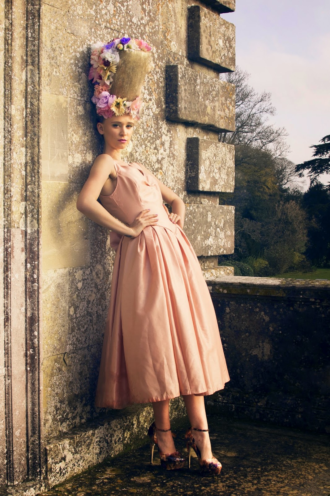
undergone prior to these images being taken. One of the favourite images from the collection where the model leaning against the wall with the tall cage wig on almost gives the illusion she is leaning, therefore making the tall wig look unstable. Therefore this image impacts on my application skills, however fortunately another image was taken of the wig, where it stands s stable and freestanding as it was on the day. The images are of a good standard to raise the quality of my portfolio and also to help adapt the social media awareness of my professional identity.


Overall the project is one that has proved successful in developing and improving my existing creative ability, collaborative skills, interpersonal skills, technical aspects of make-up application, advanced problem solving, as well as helping to identify the commercial context that as an artist is appropriate for my work. This project has also made me more aware of weaker areas in my practise which should be considered more in future projects, such as time management, product knowledge, as well as budgeting. Also the project has enhanced my awareness of creating a comprehensive body of work and widened the length and breadth of research I consider. These aspects have all collectively made me more confident, and prepared for employment. Also as a candidate for employment I feel that as a graduate I will be confident to discuss my work, and the critical understanding regarding this. I feel specialist practise has brought a culmination of skills and ideas adapted over my years of study into a very successful project outcome.