Friday, 31 October 2014
Stage review 3
After discussing my ideas with sara, I am now quite worried about the depth and lack of complexity my project has. Sara brought to my attention that one of my wigs in particular (wig 2) which requires no dressing of hair and is compiled of plaits and flowers, is not something a level 6 can showcase a high level of skill in. Therefore I am looking to develop this idea in particular and also encorporate some other complex skills into my other designs to hopefully help me to produce a better mark. My shoot is only two weeks away now so trials will be key to making sure these ideas work with the frames which have both already been made. Also I have my front lace of my wig to continue and intend to tidy up and potentially remove a few wefts that are making the wig slightly too thick for the nature of the shoot.
Saturday, 25 October 2014
Styling of the shoot

 Prior to the shoot, myself and my photographer sourced clothing from vintage shops, and also our own garments which are all included on the righthand moodboard. A lot of these items are things we believe added some classical elegance to the shoot swell as the high fashion up to date clothing we purchased from ASOS (on the left hand image). These were all floral, pastel pink toned colours which would be subtle, and not too busy and would compliment the wigs and the dainty elegant theme of the shoot. It is important to protect the clothing so that we can return the items, being on a student budget. We have chosen to purchase just two shoes, a feature shoe which is comprised of bright floral print, and a nude shoe which will compliment the brighter, busier dresses. The stiletto will elongate the models stature and the clothing will be carefully selected to work alongside and prioritise the appearance of each wig and make-up. Working with stylists is something I have openly found a challenge in the past as I find the images in a make-up artists head and the images in a stylists head are always very different, which is unsurprising as both components are very different however have to work together to make a shoot successful, however this time I am finding it a lot easier, as I feel very in control of my own project and that the stylist is to assist my outcome and not just my photographers, as it has been in the past.
The clothes will be purchased on the 15th of November, 2 weeks before our shoot day. There will be a 30 day return period, which we will obviously aim to return within 21 days of purchase, but having allowance to keep the clothing for an extra period of time incase we need to reshoot images is something that should be considered.
Thursday, 23 October 2014
Final Styling Plan
Below are the boards we created with Ella quickly on our first very last minute meeting, placing clothing accessories and shoes together in a simple way.

 The images are not put in a chronological order, and unfortunately do not have small thumbnails of the wig attached which would make it easier for our stylist, but after the late notice of changing stylist, we are thankful to have one and if more time were given and our shoot was not tomorrow, we could edit these boards to be more informative. Overall I believe the process will be simple for the stylist now the outfits can be laid out in certain orders.
Sunday, 19 October 2014
Visual Research


Skin care is something that is important in all applications, however for this beauty make-up I want to make sure my preparation right through to the application on the skin is done with precision, giving my model a dewy, naturalistic glow throughout the shoot.


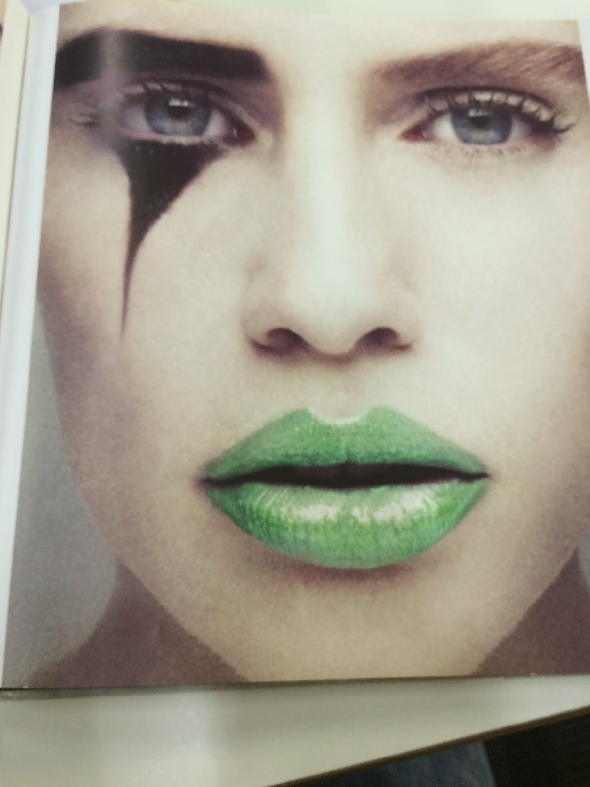
Using colour on the eyes is also key within the project. The floral aspect of the project brings so much colour around the face that a strong colour will have to be applied within the make-ups to ensure the face and make-up application is not too naturalistic, and lost within the flowers. I particularly like the green pink contrast on the right.


Using lips as a tool to hold colour is something I am also keen to do. The lips can often appear stronger than the eyes or counteract strength bringing it lower down from the strong colours of the wigs, and this is something I would like to consider using. Applying alternate textures or combination of colour on the lips is also something that could be considered within the project design stage.
 Mixing colour around the face and cheeks is something I would also like to look at. Colour can be as effective on more subtle parts of the face and on the image to the right you can see the placement on the brows is another way to consider this. I do think its quite a fashion based studio look rather than the naturalistic theme my project seems to of adopted.
Friday, 17 October 2014
Cage 1 - Tall Cage Make-Up Designs
*Please see original designs in accompanying book*
Below is the designs for the tall caged wig make-ups, with descriptions listed below;

I am happy with the format of scanning in my face charts as this adds continuity to the already developed hair design, and allows me to see the complimentary designs, what works and what dosent clearly and concisely.


The designs to the left are labelled as Design 1 and Design 2 (Tall Cage).
Design 1 looks at using gold leaf, on the lip and eye to look at the regal, monarch aspect of my narrative. It is toned down by a natural pink blusher, however I do still think the design is straying away from the naturalistic narrative of the shoot.
Design 2 uses a more subtle pink eyeshadow, attaining the feminine aspect of the shoot and also makes use of a lot of green representing 'Envy' the feeling Titania attains within this image. I feel the green is too strong and out of
the box for this image and that the gold leaf on the lip will create an undesired contrast.
The next two designs, are very similar but both use green around the eyes derived from the saying "The green eyed monster" which was also from Shakespeare in his works of Othello, so therefore fits perfectly into the narrative and also basis of my work. Design 3 uses a peach lip, which was designed to contrast the green, however I feel is a little too 'light and bright' to create an intentional beautiful contrast. Therefore I looked at using a darker, intense purple lip which I think works a lot better and is one of the looks I will be looking to carry forwards and trial.
 The next 4 looks I designed, looked at using duos of colour on the face, and also contouring with colour as well as alternate blusher shades. I also continued to trial the idea of gold leaf.


Looks 5&6 (Tall Wig) both again contained an element of green as this is something I am really certain I want to carry forward for this look. Look 5 used two colours on the lid, a pastel pink shade, contrasting but blending into an intense green. I feel this isn't something that will blend seamlessly and will clash, but would like to trial this also, as I believe the natural elements of the pink lip with the pink eye may work. Look 6 uses green in a different position, onto the lips, instead of the eyes, however I do not think this relates back to the quote of the green eyed monster and that envy may not be easily percieved and the naturalistic beautiful elements
of the make-up may be lost by the unusual lip shade.
Look 7 again trials the royal aspect of gold leaf on the face, instead of the green, and replaces the natural pinks I have been looking at with a warm red/pink blusher and lip. The make-up is very rich and a little two extravagant I feel for my character. The final look, replaces the solid shapes of the gold leaf with smaller sections around the eyes, blended with a subtle natural pink eye makeup, which is also used on the cheeks and face, with a strong shape of contour used. I don't feel this look actually gives the character enough presence, and the gold leaf may look too 'repeated'.
Overall I will be looking to conduct trials and purchase products for looks 4&5, and although they don't use a unique project such as gold leaf, I believe my selection of colours will work together to give a fun, feminine look but also bring the desired emotion of 'envy' into the piece.
Below is the designs for the tall caged wig make-ups, with descriptions listed below;
The designs to the left are labelled as Design 1 and Design 2 (Tall Cage).
Design 1 looks at using gold leaf, on the lip and eye to look at the regal, monarch aspect of my narrative. It is toned down by a natural pink blusher, however I do still think the design is straying away from the naturalistic narrative of the shoot.
Design 2 uses a more subtle pink eyeshadow, attaining the feminine aspect of the shoot and also makes use of a lot of green representing 'Envy' the feeling Titania attains within this image. I feel the green is too strong and out of
the box for this image and that the gold leaf on the lip will create an undesired contrast.
The next two designs, are very similar but both use green around the eyes derived from the saying "The green eyed monster" which was also from Shakespeare in his works of Othello, so therefore fits perfectly into the narrative and also basis of my work. Design 3 uses a peach lip, which was designed to contrast the green, however I feel is a little too 'light and bright' to create an intentional beautiful contrast. Therefore I looked at using a darker, intense purple lip which I think works a lot better and is one of the looks I will be looking to carry forwards and trial.
The next 4 looks I designed, looked at using duos of colour on the face, and also contouring with colour as well as alternate blusher shades. I also continued to trial the idea of gold leaf.Looks 5&6 (Tall Wig) both again contained an element of green as this is something I am really certain I want to carry forward for this look. Look 5 used two colours on the lid, a pastel pink shade, contrasting but blending into an intense green. I feel this isn't something that will blend seamlessly and will clash, but would like to trial this also, as I believe the natural elements of the pink lip with the pink eye may work. Look 6 uses green in a different position, onto the lips, instead of the eyes, however I do not think this relates back to the quote of the green eyed monster and that envy may not be easily percieved and the naturalistic beautiful elements
of the make-up may be lost by the unusual lip shade.
Look 7 again trials the royal aspect of gold leaf on the face, instead of the green, and replaces the natural pinks I have been looking at with a warm red/pink blusher and lip. The make-up is very rich and a little two extravagant I feel for my character. The final look, replaces the solid shapes of the gold leaf with smaller sections around the eyes, blended with a subtle natural pink eye makeup, which is also used on the cheeks and face, with a strong shape of contour used. I don't feel this look actually gives the character enough presence, and the gold leaf may look too 'repeated'.
Overall I will be looking to conduct trials and purchase products for looks 4&5, and although they don't use a unique project such as gold leaf, I believe my selection of colours will work together to give a fun, feminine look but also bring the desired emotion of 'envy' into the piece.
Cage 2 (Floral Cage) Make-up Designs x8


Design 1 for my naturalistic look uses a light pink 'smog' around the eye, keeping the feminine mythical theme but also a green lip, which although considered a natural colour, may not be considered so on the placement of the lips.
Design 2, again uses green in an unconventional placement, contouring the cheeks, which again despite the other natural beauty elements of the design, will not represent the level of nature I am looking for. However the elements I have found so far that do suggest a good design idea will be carried forwards in the process.
Design 3, uses a rose pink cheek to draw a level of eye contact away from the smoked brown eye, this is complimented by a rose pink lip, which although keeping colours very natural and modern, give some detail and skill into the make-up application.
Design 4, uses elements from design 2, a feminine pink cheek and lip, but again tried to echo the green natural eye, which I have already suggested will be trialled by the tall cage. I think drawing away from green and looking at using different aspects of my colour palette is essential to the rest of this process.


Design 5 has brought a return of a suggestion of gold leaf into the make-up. A small placement of it on the eye may stand out from the natural based make-ups and just give the idea of a 'flicker' of her original glamour still existing, however I still think this could be executed better in one of the other looks. The strong cheek colour also may not fit with the 'toning down' of the make-up for this specific image.
Design 6 returns to the use of feminine colours, bringing the purple back from the earlier designs that represented mythical faerie based ideas so well, this mixed with the pink tones on the face if done in subtle tones is something I would like to take forwards and trial, to see if a level of colour can still be contained in this image.
Design 7 again uses green, which I also think could be a 'reflection' of the envy Titania gains in the second 'tall wig' designs and image idea, but paired with the coral lip I fear may be too similar of an idea to one I will be trialling for that look and I really want a variety of make-ups through the series.
The final design 8, again returns to the idea of a gold leaf image, placing it on the eyes, toned in to a warm yet subtle metallic brow, which may also keep a glimmer of regal-ness in the image, however I designed this with an also full lip of gold leaf, which I think draws from the naturalistic ideas and also the contouring is too sharp for the softer base I want this image to represent.
I have chosen from this set of designs to take forward Design 3 and design 6, to question whether colour has a place in this look, or wether it needs to bring more earthy tones back to the humbled character.
Lace Front Wig Make-Up Designs
For this project I really wanted to concentrate on an alternate design structure. Therefore once I had completed the hair designs, I then scanned in the face chart and sketched on make-up ideas. I focused on 8 for each piece, so 24 in all, which is double the amount I have chosen to develop compared to the last unit. *Please see original designs in accompanying book*
 Design 1 (Lace Front Wig) was designed using a triad of colours, pink purple and blue, to help create the vision of a faerie queen, emerging from her bright floral 'kingdom'. I added very small amounts of blue, as this is a colour that does not appear in my wigs. The feminine eye shape works with the pale pink blush contouring on the cheek, to create this impression, and the purple lip makes the look more eyecatching and powerful to the viewer. Design 2 uses a duo of purples on the eye, accentuated around the eye socket. Purple is a colour very connected to dreams, hence my selection and draws the viewer to the models eyes, accompanied by a natural yet feminine pink lip
 Design 3, is the only design using no eyelashes for this wig. I also wanted to look at using no eye make-up at all and expressing colour through the lips and cheek, however I think using a purple cheek with a pink and green gradient lip is a little too powerful and more of a colour clash than a beautiful contrast of colour, and doesn't give the essence of nature through the face. Design 4, uses gold leaf to express the royal aspect of the faeries, and brings some texture into the piece. I think the design uses too much on this occasion, however paired with a purple lip would give a lovely rich tone, for another narrative shoot, but unfortunately not this one. The natural cheek doesn't tone down this look enough.


Design 5, looks at using a naturalistic green colour around the eye as this can often be a colour associated with mythical faeries, contrasted with a purple lip, however looking at my narrative and the idea of envy I believe this would be better suited to the tall cage wig look. Design 6 uses a lot of angular colour placement and contour on the cheek, inverting the highlight and contour so that the deeper purple is placed ontop of the pink. These colours are repeated around the eye giving an angular feel. This paired with the orange toned pink lip potentially could add an edgy yet feminine feel to the look and is something I am looking to trial.
Design 7 again looks at using purple on the eye with a pink lip, similar to design two, and uses a natural rose pink blusher. Despite a lot of my designs using a lot of colour, I feel this one doesnt have enough colour placed on the face and the make-up may get lost in the vibrance of the wigs.
Design 8 again uses a duo of colours the same as design 2, however these are contrasting colours. I have tried the green around the eye one more time, blending it with a pink shadow, however I don't think that blending two contrasting shades is the right thing to do for such a naturalistic beauty based image.
After analysing my images in this way, a lot more critically than when I placed the colours onto the templates, I have decided to take forward design 2 and also something a little different in design 6 for trialling on the face and then further development.
Wednesday, 15 October 2014
Final Cage Wig 2 Design

Final Cage Wig 1 Design

The shape represents that of a flower pot, and the ridge of barrel curls at the top back of the wig replicate that of folds of terracotta often seen on flowerpots. The flowers will 'spill' over the rim of the pot, and will implode towards the face - on the front of the wig. The back remains simplistic, yet extravagant in shape. This will express the feelings of Titania within my narrative, and how she becomes an extravagant character in an attempt to impress the human royalty.
Monday, 13 October 2014
Friday, 10 October 2014
Context: Wonderland Magazine and FaceOn Magazine
"Wonderland is an international, independently published magazine offering a unique perspective on the best new and established talent across all popular culture: fashion, film, music and art.
We entertain, challenge and inform both men and women with editorial and fashion shot by the most in-demand photographers working today – we want to represent the positive and the playful elements of the fashion industry. We’re about inspiring, rather than dictating to our readers.
The magazine is available from all good newsagents and WH Smith. You can find us online at wonderlandmagazine.com. Follow us on Facebook and Twitter. " - Taken from Wonderlandmagazine.com

<< November 2014 Issue Front Cover.
Looking through Wonderlands website, a lot of the work is celebrity inspired and is based around alternative but already famed people.
 Right is a beautiful image from the website of Cara Delevinge and Pharell Williams, who are set to star in a new chanel film. This is the most mythical thing I could find on the whole website and I feel for a mythical fashion based shoot, this would not be the right media for it. I instead have looked at FaceOn Magazine, which is predominantly make-up based but also has a lot of fashion input, and most importantly includes a lot of mythical shoots which would be appropriate to include ours in.
FaceOn Magazine;

 FaceOn Magazine is a relatively new magazine, which was created in 2008. The magazine is for those who 'love make-up and beauty' and features a lot of work from up and coming, and new make-up artists along with tutorials, and product reviews. This is the kind of media I see my work sitting in from a Make-up Artist perspective. Below are a few images from the magazines website;


Thursday, 9 October 2014
Lecture Programme Autumn 2014
Throughout the term we have had a selection of lecture sessions that will inform our make-up practise. Below is a short description of each one and how it helped inform my own project.
- Imagining the Demonic;
This lecture looked at how the demonic can be imagined through history/religion/ethnology/phycology/mythology/art as well as how cultural beliefs, and how our own mind creates a response to what we think the demonic is.
Although I feel this lecture was a lot more helpful for members of the group studying prosthetics and looking at the demonic and grotesque, it also encouraged me to look at the myhthology of faeries, and referencing the book 'Good Faeries Bad Faeries' I was able to source some images of demonic faeries, and this informed my research into the mythological side of the study.
- Digital Make-up Design;
This lecture looked at how make up and CGI techniques have improved throughout history and also how the make-up industry is threatened by the advances in CGI and how it could soon completely replace prosthetic make-up but also cosmetic beauty make-ups if need be. This is something to consider throughout my studies even as someone who initially works with hair and wigs, the costings of this trade could potentially be endanger in the future, as CGI could be a cheaper alternative.
- Hair Politics;
This session discussed a chronological order of the development of hair and wigs from the Egyptian era up until todays styles. This lecture was very engaging for myself who has chosen to develop my skills in hair styling and design, so will be crucial for me to recap on for this project swell as future projects. Unfortunately there was no information on the elizabethan period, therefore I am unable to reference information relating to this period in time, however will refer to this project when starting any project involving hair, to hopefully spark a research session in the historical aspects of the hair.
- Commercial and editorial work;
This lecture with Laura covered how make-ups are defined through different parts of the industry and what regulations (lighting, camera style etc.) that are pretty standard to individual industries will effect certain aspects of the make-up design and application. We also discussed portfolios and what to include in them. I found this very useful, and will be referencing it in my PPP unit, but it has also contributed to the layout of my portfolio in this units hand in. I will be looking at the techniques noted down for beauty make-ups in this lecture, and how I can apply them when applying and designing my own make-ups.
- The cosmetic advertisement semiotic analysis;
This lecture was one I was very keen to attend, as having briefly covered it in my written unit last year it is something I was interested in. The lecture covered how we read an image and how it is constructed to be read by the consumer. This made me consider my context in more depth and how I will use my images to construct an appropriate final outcome.
- Sustainability and the make-up artist;
This lecture I unfortunately was not in attendance for due to illness, however my peers have informed me the lecture was very useful and discussed the sustainability of make-up and cosmetic hair and skin products and also some of the sulphates and other ingredients hidden in products which are very bad for health. This is something I am very aware of, and also struggle with, as an avid fan of MAC as an in particular brand, I struggle to use their products knowing that they 1. Animal test, especially being owned by Estee Lauder who claim all their products are cruelty free. and 2. use chemicals and pigments that are within the guidelines of their manufacturers in China, yet would be banned in the UK. This is just one brand I am aware of that practise exactly what was discussed in the lecture, however I know more also do. As I practise more in make-up and begin to rebuild my kit, I would like to use brands that are cruelty and paraben free so I can confidently use the products and agree with their ethical background.
Wednesday, 8 October 2014
Knotting the Front Lace


The process was something I have completed before so I found it simple, however I really did notice I have become a lot quicker at knotting the front lace, and this took me approximately 10 hours compared to the 24 hours it took me last year. I also found my technique a lot more accurate, having not snagged the lace once, this was something I struggled with last year when making my wigs, and I am happy to of developed this and hopefully abolished any damaged lace now. Overall I am very pleased with the front lace which effectively blends into the wefts and is of good quality.
Editing wefted wig - Removing Wefts
 Throughout the process of making my wefted wig, I have been aware of the fact that it is a relatively thick wig which may potentially need thinning in some way, wether through styling or removing a weft. I decided to re evaluate the situation once the front lace was finished. I then chose to remove a weft as the wig had a lot of hair in it, and it was actually a very heavy wig, so reducing weight as well as bulk would be the right thing to do in this situation. From the images on this post you can clearly tell the before and after images, in which the wig looks a much better more realistic thickness than it did originally. I am pleased i removed a weft as it allowed me to get a better finish without cutting into the wig which I wanted to remain a nice natural even length, which looked untouched.

Tuesday, 7 October 2014
Making the floral headband


 As mentioned previously, I am creating a headband which will be used on the knotted lace wig, as a dressing and reference to the floral element of the project, and also as an individual piece requested by my photographer to complete her 4th look required for her brief.
The headband was very simple to make. I purchased a plain headband comprised of two pieces of metal, spot welded at the bottom - something which would be very easy to replicate . I then covered it in lace, as i did the bases of my cage wigs, before stitching tutu net across each side of the headband, keeping it tight so it was able to hold the flowers ontop. Following the same guidelines of glueing the flowers on, I added flowers again in an order which worked to reflect the shape and style of the band, before adding some smaller flowers to fill any gaps. The headband was quick to make, and as it was not one of my original pieces I hadn't designated a lot of time to the headband, however I am very happy with the final result, and believe it will be a small but effective element of my final shoot.
Styling Lace Front Wig


 The image above (left) is a method of curling hair that required 'no electrical heat' and using a circlular item, I curled the synthetic hair around it and ran it hot water over it before letting it dry naturally. The effect was very disappointing and didn't really do anything therefore I reverted back to using very low gentle heat on the hair which worked beautifully. I continued this in layers throughout the wig, applying heat for a range of 10-15 seconds at a time to create some natural softer curls throughout the tighter more defined curls. I also incorporated a rope twist in the hair which was ever popular throughout the shakespearian elizabethan era, but gave a dainty dressed finish to the wig. The front of the wig used a middle parting which was specifically knotted, and a fringe which swept across the face, covering parts of the forehead - a reminder this is a fairy in elizabethan period and not a human who would of shown predominantly the forehead in a historically correct hairstyle. The hairband finishes the piece of bringing the floral element into the project and gave an outcome that I am very proud of.
Subscribe to:
Comments (Atom)